Image Optimization for the Web: A Complete Guide to Formats, Compression, and Performance
Learn everything about optimizing images for the web: compare formats (JPEG, PNG, WebP, AVIF, SVG), understand compression types, improve Core Web Vitals, and speed up your website.
Why Image Optimization Matters
Images typically account for 40-60% of the total weight of a web page. According to the HTTP Archive, the median web page loads over 900 KB of images. That means images are the single biggest opportunity for improving page load speed, and page speed directly affects three critical outcomes: user experience, search engine rankings, and conversion rates.
Google has made page speed a ranking factor since 2010 for desktop and 2018 for mobile. The Core Web Vitals metrics, particularly Largest Contentful Paint (LCP), are heavily influenced by image loading performance. An unoptimized hero image can single-handedly push your LCP beyond the 2.5-second threshold that Google considers "good," resulting in lower search rankings.
Beyond SEO, the numbers on user behavior are clear: 53% of mobile visitors abandon a page that takes longer than 3 seconds to load (Google research). Every 100 milliseconds of added load time can reduce conversion rates by up to 7% (Akamai). If your site loads slowly because of unoptimized images, you are literally losing visitors and revenue.
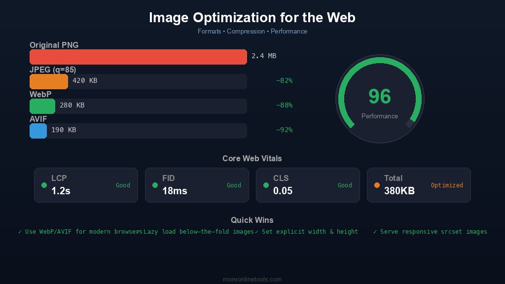
Image Format Comparison: Choosing the Right Format
Selecting the right image format is the most impactful optimization decision you can make. Each format has specific strengths and ideal use cases. Here is a detailed breakdown:
JPEG (Joint Photographic Experts Group)
JPEG has been the workhorse of web images since the 1990s. It uses lossy compression, meaning it permanently discards some image data to achieve smaller file sizes.
- Best for: Photographs, complex images with many colors and gradients, hero images, product photos
- Not suitable for: Text, line art, logos, images requiring transparency, screenshots with sharp edges
- Compression: Lossy only. Quality can be adjusted from 0 to 100. A quality setting of 75-85 typically provides a good balance between visual quality and file size.
- Transparency: Not supported
- Animation: Not supported (MJPEG exists but is rarely used on the web)
- Browser support: Universal, every browser supports JPEG
A practical tip: most JPEGs exported from cameras or design tools are at quality 90-100, which produces unnecessarily large files. Reducing quality to 80 typically saves 40-60% of the file size with no perceptible quality difference to the human eye. You can do this instantly with our Image Compression tool.
PNG (Portable Network Graphics)
PNG was created as a patent-free replacement for GIF and uses lossless compression, preserving every pixel exactly as-is.
- Best for: Logos, icons, screenshots, images with text, diagrams, anything requiring transparency
- Not suitable for: Photographs (files will be 5-10x larger than JPEG for the same image)
- Compression: Lossless. File size depends on image complexity and the number of unique colors.
- Transparency: Full alpha channel support (256 levels of transparency)
- Animation: APNG is supported in modern browsers
- Browser support: Universal
PNG-8 (indexed color, up to 256 colors) produces much smaller files than PNG-24 (true color). If your image uses a limited color palette, such as a simple logo or icon, converting to PNG-8 can reduce file size by 60-80%.
WebP
Developed by Google, WebP is a modern format that supports both lossy and lossless compression, and consistently produces smaller files than JPEG and PNG.
- Best for: Almost everything. WebP is an excellent general-purpose format for the modern web.
- Compression: Both lossy and lossless. Lossy WebP produces files 25-34% smaller than JPEG at equivalent visual quality. Lossless WebP produces files 26% smaller than PNG.
- Transparency: Supported in both lossy and lossless modes
- Animation: Supported, producing files much smaller than GIF
- Browser support: Supported in Chrome, Firefox, Safari, Edge, and Opera. Over 97% of users globally can view WebP images.
WebP is now the recommended default format for most web images. Convert your existing JPEG and PNG files to WebP using our Image Format Converter and see the file size savings for yourself.
AVIF (AV1 Image File Format)
AVIF is the newest contender, based on the AV1 video codec. It offers even better compression than WebP but with some trade-offs.
- Best for: Photographs and complex images where maximum compression is needed
- Compression: Both lossy and lossless. Lossy AVIF produces files 20-50% smaller than WebP at equivalent visual quality.
- Transparency: Supported
- Animation: Supported
- Drawbacks: Slower to encode and decode than WebP or JPEG. Browser support is growing but not yet universal (about 92% global support as of early 2026). Maximum image dimension limitations exist in some implementations.
- Browser support: Chrome, Firefox, Safari 16.4+, Edge, Opera
SVG (Scalable Vector Graphics)
SVG is fundamentally different from the formats above. Instead of storing pixel data, SVG stores mathematical descriptions of shapes, making it resolution-independent.
- Best for: Icons, logos, illustrations, charts, simple graphics, anything that needs to scale without quality loss
- Not suitable for: Photographs or complex images with many colors
- Compression: Being text-based (XML), SVGs can be compressed with gzip/brotli by the web server, often achieving 60-80% size reduction
- Scalability: Infinite. Looks crisp on any screen size or resolution, from mobile to 8K displays
- Animation: Supports CSS and JavaScript animation
- Browser support: Universal
You can optimize SVG files by removing unnecessary metadata, simplifying paths, and removing hidden layers. Our SVG Optimizer does this automatically and can reduce SVG file sizes by 30-60%.
Format Comparison Summary
| Format | Type | Transparency | Best For | Typical Savings vs Original |
|---|---|---|---|---|
| JPEG | Lossy | No | Photographs | Baseline format |
| PNG | Lossless | Yes | Graphics, screenshots | Baseline format |
| WebP | Both | Yes | General purpose | 25-34% vs JPEG |
| AVIF | Both | Yes | Photographs | 20-50% vs WebP |
| SVG | Vector | Yes | Icons, logos | N/A (different use case) |
Lossy vs. Lossless Compression Explained
Understanding the difference between lossy and lossless compression is essential for making informed optimization decisions.
Lossless Compression
Lossless compression reduces file size without losing any data. The decompressed image is bit-for-bit identical to the original. It works by finding patterns and redundancy in the data and encoding them more efficiently, similar to how a ZIP file works.
- Formats: PNG, lossless WebP, lossless AVIF, GIF
- Typical reduction: 20-50% depending on image content
- Use when: You need pixel-perfect accuracy (screenshots, technical diagrams, medical imaging, text in images)
Lossy Compression
Lossy compression achieves much greater size reduction by permanently removing data that the human visual system is less sensitive to. The key insight behind lossy image compression is that humans are more sensitive to changes in brightness than in color (chroma subsampling), and less sensitive to high-frequency details (quantization).
- Formats: JPEG, lossy WebP, lossy AVIF
- Typical reduction: 60-90% depending on quality setting
- Use when: Photographs and complex images where perfect pixel reproduction is not required
The practical approach: start with a quality setting of 80 and check the visual result. If it looks identical to the original, try lowering to 70. If artifacts are visible, increase to 85. Our Image Compression tool lets you adjust quality in real-time and compare the result side by side with the original, and you can also use our Image Compare tool to spot differences between the original and compressed versions.
Responsive Images: Serving the Right Size
One of the most common and wasteful mistakes is serving a 3000x2000 pixel image to a mobile device with a 375px wide viewport. The browser downloads megabytes of data only to resize it to a fraction of the original size. Responsive images solve this problem.
The srcset and sizes Attributes
HTML provides built-in support for responsive images through the srcset and sizes attributes:
<img
  srcset="hero-400.webp 400w,
          hero-800.webp 800w,
          hero-1200.webp 1200w,
          hero-1600.webp 1600w"
  sizes="(max-width: 600px) 100vw,
         (max-width: 1200px) 50vw,
         800px"
  src="hero-800.webp"
  alt="Hero image"
  width="800"
  height="450"
>
The browser automatically selects the most appropriate image size based on the viewport width and device pixel ratio. This means a mobile user downloads a 400px wide image (perhaps 30 KB) instead of the full 1600px version (200+ KB).
The picture Element for Format Switching
Use the <picture> element to serve modern formats with fallbacks:
<picture>
  <source srcset="photo.avif" type="image/avif">
  <source srcset="photo.webp" type="image/webp">
  <img src="photo.jpg" alt="Description" width="800" height="450">
</picture>
Browsers that support AVIF will download the smallest file. Those that do not will fall back to WebP, and older browsers will get the JPEG. This is a progressive enhancement strategy that benefits all users.
Before creating responsive image sets, you need to resize your images to multiple dimensions. Our Image Resize tool makes this straightforward, and you can then convert each size to multiple formats using the Image Format Converter.
Lazy Loading: Load Images Only When Needed
Lazy loading defers the loading of off-screen images until the user scrolls near them. This is one of the simplest and most impactful performance optimizations you can implement.
Native Browser Lazy Loading
Modern browsers support lazy loading natively with a single HTML attribute:
<img src="photo.webp" alt="Description"
     loading="lazy" width="800" height="450">
This is supported in Chrome, Firefox, Safari, and Edge. The browser handles all the intersection detection and loading logic automatically. No JavaScript library needed.
Best Practices for Lazy Loading
- Do NOT lazy load above-the-fold images: Your hero image, logo, and any content visible without scrolling should load immediately. Lazy loading these will actually hurt your LCP score.
- Always specify width and height: This allows the browser to reserve space for the image before it loads, preventing layout shifts (CLS).
- Use a lightweight placeholder: Show a low-quality image placeholder (LQIP), a dominant color, or an SVG placeholder while the full image loads.
- Set fetchpriority for critical images: Use
fetchpriority="high"on your LCP image to signal the browser to prioritize it.
Image Metadata: Why You Should Strip It
Digital photos contain hidden metadata called EXIF (Exchangeable Image File Format) data. This includes camera model, exposure settings, GPS coordinates, date and time, and sometimes even the software used to edit the image.
There are two important reasons to strip this metadata before publishing images on the web:
- File size: EXIF data can add 10-50 KB to each image. For a page with 20 images, that is 200 KB to 1 MB of unnecessary data.
- Privacy: GPS coordinates in photos can reveal your home address, workplace, or the exact location where a photo was taken. This is a serious privacy concern, especially for images of people or private locations.
Most image compression tools strip metadata automatically. You can inspect what metadata your images contain using our Image Metadata Viewer before deciding what to remove.
Core Web Vitals and Images
Google's Core Web Vitals are three specific metrics that measure real-world user experience. Images directly impact two of them:
Largest Contentful Paint (LCP)
LCP measures how long it takes for the largest visible content element to finish loading. In most cases, this is an image. To achieve a "good" LCP (under 2.5 seconds):
- Optimize the LCP image aggressively (compress, use modern formats, serve the right size)
- Preload the LCP image:
<link rel="preload" as="image" href="hero.webp"> - Do NOT lazy load the LCP image
- Use
fetchpriority="high"on the LCP image element - Ensure the image is served from a CDN or a fast server
Cumulative Layout Shift (CLS)
CLS measures visual stability. Images without explicit width and height attributes cause layout shifts as they load, pushing content around the page. To achieve a "good" CLS (under 0.1):
- Always specify
widthandheightattributes on<img>tags - Use CSS
aspect-ratiofor responsive images - Reserve space for images with CSS before they load
CDN Benefits for Image Delivery
A Content Delivery Network (CDN) serves your images from servers geographically close to your users. Here is why this matters:
- Reduced latency: A user in Tokyo loading an image from a server in New York experiences ~200ms of network latency per round-trip. A CDN edge server in Tokyo reduces this to ~10ms.
- Automatic format negotiation: Many CDNs (Cloudflare, Cloudinary, imgix) can automatically serve WebP or AVIF to browsers that support them, and fall back to JPEG/PNG for older browsers.
- On-the-fly resizing: CDN image services can resize images based on URL parameters, eliminating the need to pre-generate multiple sizes.
- Caching: CDN edge servers cache your images globally, reducing load on your origin server.
- Bandwidth savings: Less data transferred from your origin server means lower hosting costs.
A Practical Image Optimization Workflow
Here is a step-by-step workflow you can follow for every image you add to your website:
- Start with the right dimensions: Do not upload a 4000px wide image if it will never be displayed larger than 1200px. Resize your image to the maximum display size first.
- Choose the right format: Use WebP as your default. Use SVG for icons and logos. Use AVIF if you need maximum compression and can accept the encoding time. Use our Image Format Converter to switch between formats.
- Apply compression: For photographs, use lossy compression at quality 75-85. For graphics, use lossless compression. Test with our Image Compression tool to find the sweet spot.
- Strip metadata: Remove EXIF data to reduce file size and protect privacy. Check with the Image Metadata Viewer first.
- Create responsive sizes: Generate 3-5 sizes for each image (400w, 800w, 1200w, 1600w) using the Image Resize tool.
- Implement lazy loading: Add
loading="lazy"to all images below the fold. - Set dimensions: Always include
widthandheightattributes to prevent CLS. - Verify: Use Google PageSpeed Insights to check your image optimization score and identify remaining issues.
Common Mistakes to Avoid
- Using PNG for photographs: A photo saved as PNG can be 5-10x larger than the same photo as a JPEG or WebP. PNG is for graphics, not photos.
- Not specifying image dimensions: This causes layout shifts (CLS) and hurts your Core Web Vitals score.
- Lazy loading the hero image: Your above-the-fold images should load as fast as possible. Lazy loading them delays LCP.
- Ignoring modern formats: If you are still serving only JPEG and PNG in 2026, you are leaving significant file size savings on the table. WebP and AVIF are widely supported.
- Over-compression: Compressing a JPEG at quality 20 produces visible artifacts and looks unprofessional. Find the balance between file size and visual quality.
- Serving the same image to all devices: A 1600px wide image is wasted bandwidth on a 375px mobile screen. Use responsive images.
- Forgetting alt text: While not a compression issue, empty or missing alt attributes hurt accessibility and image SEO. Every image should have descriptive alt text.
Summary: Key Takeaways
Image optimization is not a one-time task but an ongoing practice. Here are the essential points:
- Images are the biggest factor in page weight. Optimizing them provides the greatest performance return.
- WebP should be your default format. Use AVIF for maximum compression, PNG for transparency in graphics, SVG for vector content, and JPEG as a universal fallback.
- Lossy compression at quality 75-85 is visually indistinguishable from the original for most photographs.
- Always serve responsive images using
srcsetandsizesto avoid sending oversized images to small screens. - Lazy load below-the-fold images but never the LCP image.
- Strip metadata to save file size and protect user privacy.
- Specify
widthandheighton every image to prevent layout shifts. - Use a CDN for faster global delivery and automatic format negotiation.
Compress Your Images Now
Reduce image file sizes without visible quality loss. Everything runs in your browser, no upload to any server.