CSS Units Explained: px, rem, em, vh — and When to Use Each
Picking the wrong CSS unit causes layouts that break at different screen sizes, fonts that ignore user preferences, and spacing that feels inconsistent. Here is a practical guide to choosing the right unit every time.
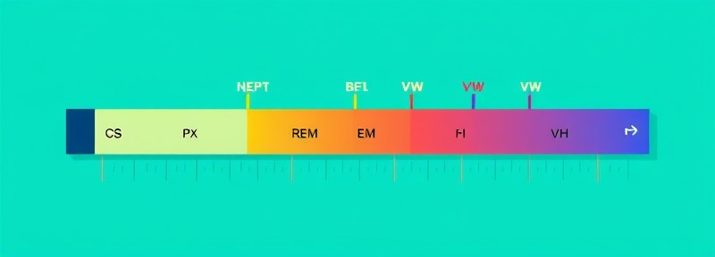
Why CSS Units Matter
CSS has more than a dozen length units, but most developers use five in practice: px, rem, em, %, and the viewport units vh and vw. Choosing wrong is not always obvious — the layout might look fine on your screen and break on someone else's, or pass visual QA and fail an accessibility audit because it ignores the user's browser font-size preference.
This guide explains what each unit actually measures, gives you a concrete decision rule for each situation, and covers the mistakes that come up again and again in code reviews.
px — Absolute Pixels
One CSS px maps to one device-independent pixel, not necessarily a physical screen pixel. On a 2x retina display, one CSS px is rendered using 2 physical pixels. This means px is consistent across screens in terms of visual size, but it is absolute — it does not scale with anything.
When to use px:
- Borders:
border: 1px solid— a 1px border should always look like a thin line, regardless of context - Box shadows and outlines: precision details that should not scale
- Media query breakpoints:
@media (min-width: 768px) - Fixed-size decorative elements (icons with a defined size, dividers)
When not to use px: font sizes, padding, and margin. A user who sets their browser font size to 20px because they have difficulty reading small text will not benefit from your layout if everything is hardcoded in px. Their preference is ignored entirely.
rem — Root Em
rem stands for "root em." It is always relative to the font-size of the html element, never to the parent. This makes it predictable in ways that em is not.
By default, most browsers set the root font size to 16px. So:
1rem = 16px | 1.5rem = 24px | 0.875rem = 14px
When to use rem:
- Font sizes — rem respects the user's browser font preference
- Spacing that should scale consistently with type size (padding, margin, gap)
- Component sizing when you want everything to scale together
The 62.5% trick: Some developers set html { font-size: 62.5%; } to make 1rem equal 10px (since 62.5% of 16px = 10px). This simplifies mental math: 1.4rem = 14px. The trade-off is that it overrides the user's base font preference unless you use it carefully — only do this if you understand the accessibility implications and override at the component level.
em — Relative to Parent
em is relative to the computed font-size of the current element (or the parent, when applied to font-size itself). This makes it useful for components that need to scale proportionally to their own text size.
Classic use case: button padding. If you write padding: 0.5em 1em, the button padding scales automatically when you change the button's font-size — small buttons get smaller padding, large buttons get more.
.btn { font-size: 1rem; padding: 0.5em 1em; }

                .btn-lg { font-size: 1.25rem; /* padding scales automatically */ }
The compounding problem: When you nest elements with em font-sizes, they multiply. A parent at 1.2em and a child at 1.2em gives the child an effective size of 1.44em. This is why rem is preferred for font sizes in most cases — rem always references the root, so nesting does not compound.
When to use em: padding, margin, and line-height on components where you want sizes to track the component's own font-size. Avoid em for font-size in nested components.
% — Percentage
Percentage is always relative to the parent element's corresponding dimension. Width percentages are relative to parent width; height percentages are relative to parent height (with caveats).
It is especially useful for fluid layouts: width: 100% means "take up all available width." Used with max-width, it creates responsive containers:
.container { width: 100%; max-width: 1200px; margin: 0 auto; }
For font-size, percentage behaves like em — it multiplies with the parent. Use rem instead for more predictable results.
vh, vw — Viewport Units
1vh = 1% of the viewport height. 1vw = 1% of the viewport width. These do not depend on any element — they always refer to the browser window size.
When to use viewport units:
- Full-screen sections:
height: 100vhfor a hero that fills the screen exactly - Fluid typography:
font-size: clamp(1rem, 2.5vw, 2rem)for text that scales smoothly between screen sizes without media queries - Full-width images or videos:
width: 100vwto break out of a container
The mobile browser bar problem: On mobile browsers, the address bar appears and disappears as you scroll, changing the viewport height. 100vh can cause content to be cut off or create scrollbars. CSS added dvh (dynamic viewport height), svh (small — address bar visible), and lvh (large — address bar hidden) to handle this. Browser support for dvh is good in 2024+. Use height: 100dvh for full-screen layouts on mobile.
The CSS Unit Decision Guide
| What you are sizing | Use this | Why |
|---|---|---|
| Body / global font size | rem | Respects user preference, no compounding |
| Component font size | rem | Consistent, predictable |
| Component padding / margin | em or rem | em if you want it to track font-size; rem for consistency |
| Borders, box-shadows | px | Should never scale |
| Media query breakpoints | px or em | px for simplicity; em so breakpoints scale with font preferences |
| Fluid container width | % + max-width | Takes available space, caps at maximum |
| Full-height hero section | 100dvh | Accounts for mobile browser bars |
| Fluid typography | clamp() with rem + vw | Scales smoothly between breakpoints |
The Most Common Mistakes
1. Using px for all font sizes. This breaks accessibility. Users who increase their browser base font size will find your text unchanged. Use rem for font sizes so the UI respects that preference.
2. Using em for font sizes in nested components. The compounding problem hits here. A menu inside a card inside a modal can end up with 3× compounding. Use rem for font sizes.
3. Using vh for full-screen layouts without dvh fallback. On mobile, the address bar causes layout shifts. Use min-height: 100svh or height: 100dvh.
4. Forgetting that % height requires a parent with explicit height. height: 100% on a child has no effect if the parent has height: auto. Use vh or flexbox instead.
The px → rem Conversion Formula
The default root font size is 16px. The formula to convert:
Example:
24px ÷ 16 = 1.5rem
If you work with a design tool that outputs pixels, our PX to REM Converter handles the math instantly. Paste any px value (or a list of values) and get the rem equivalent, with support for custom root sizes.
Convert px to rem Instantly
Paste any pixel value and get the rem equivalent. Supports custom base font sizes.