Color Theory for Web Design: Shades, Contrast, and Design Systems
A practical guide to color theory for modern web design -- learn HSL fundamentals, shade scales, WCAG contrast standards, and how to build a consistent design system palette.
Color Theory Basics for Web Design
Color is one of the most powerful tools in a web designer's toolkit. It influences mood, guides attention, communicates brand identity, and shapes how users perceive quality. To use color well on the web, you do not need to be a fine artist -- but you do need to understand a few fundamentals that come straight from classical color theory.
Hue, Saturation, and Lightness
Modern web design almost always works in the HSL color model (Hue, Saturation, Lightness) because it mirrors how humans actually think about color. Unlike RGB, which asks you to mix red, green, and blue channels, HSL lets you describe a color the way a designer would.
- Hue is the color itself, measured in degrees from 0 to 360 on the color wheel. 0 is red, 120 is green, 240 is blue.
- Saturation is the intensity of the color, from 0% (gray) to 100% (fully vivid). Muted brand palettes tend to live around 30-60%.
- Lightness is how light or dark the color is, from 0% (black) to 100% (white). 50% is the pure, most vivid version of a hue.
Once you internalize HSL, creating variations of a color becomes mechanical. Want a darker blue for a hover state? Lower the lightness. Want a softer background tint? Raise the lightness and drop the saturation a little. No guesswork, no hex-code mental math.
Primary, Secondary, and Tertiary Colors
Traditional color theory divides hues into three groups. Primary colors (red, yellow, blue) cannot be mixed from other colors. Secondary colors (orange, green, violet) are created by mixing two primaries. Tertiary colors sit between a primary and a secondary -- red-orange, yellow-green, blue-violet, and so on.
On the web, this hierarchy translates into color relationships. Complementary colors (opposite on the wheel) create strong contrast and are great for call-to-action buttons. Analogous colors (neighbors on the wheel) feel harmonious and work well for backgrounds and illustrations. Triadic schemes (three evenly spaced hues) produce vibrant, balanced palettes often seen in playful brands.
Understanding Color Shades and Tints
In day-to-day web work you rarely use a single color. A button has a base color, a hover color, a pressed color, a disabled color, a focus ring, and a subtle background tint. All of these come from a structured shade scale derived from one hue.
Shades vs. Tints vs. Tones
The vocabulary matters here. A tint is a color mixed with white (making it lighter). A shade is a color mixed with black (making it darker). A tone is a color mixed with gray (making it less saturated). In everyday conversation and in most CSS frameworks, the word "shade" is used loosely to mean any variation in lightness, and that is the convention we will follow.
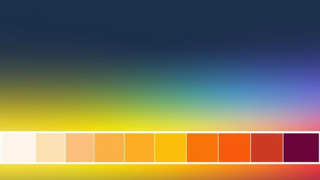
The 50-900 Scale Explained
The 50 to 900 numeric scale became popular thanks to Material Design and Tailwind CSS, and it is now the de facto standard for design systems. The idea is simple: each number represents a step on the lightness axis, from nearly white to nearly black.
| Shade | Typical Lightness | Common Use Case |
|---|---|---|
| 50 | ~97% | Soft backgrounds, hover fills on white surfaces |
| 100 | ~94% | Card backgrounds, section dividers |
| 200 | ~87% | Disabled elements, subtle borders |
| 300 | ~77% | Placeholder text, inactive icons |
| 400 | ~65% | Secondary text, muted UI accents |
| 500 | ~50% | Base brand color, primary buttons |
| 600 | ~42% | Button hover, emphasized links |
| 700 | ~34% | Button pressed, strong headings |
| 800 | ~25% | Dark UI surfaces, high-contrast text |
| 900 | ~15% | Near-black accents, deepest shadows |
The power of this scale is predictability. Once your team agrees that 500 is the base and 600 is the hover, every button in the product behaves the same way. You stop arguing about exact hex values and start thinking in semantic tokens.
WCAG Contrast Standards
A beautiful palette that fails accessibility is not a successful palette. The Web Content Accessibility Guidelines (WCAG) define measurable contrast requirements that protect users with low vision, color blindness, and situational impairments like glare on a phone screen in sunlight.
Contrast Ratios Explained
Contrast ratio is a number between 1:1 (no contrast, same color) and 21:1 (maximum contrast, pure black on pure white). It is calculated from the relative luminance of two colors, taking human perception of brightness into account.
| Level | Normal Text | Large Text (18pt+ or 14pt bold) | UI Components |
|---|---|---|---|
| AA (minimum) | 4.5:1 | 3:1 | 3:1 |
| AAA (enhanced) | 7:1 | 4.5:1 | - |
Why Accessibility Matters
Approximately 1 in 12 men and 1 in 200 women have some form of color vision deficiency. Add age-related vision decline, temporary impairments, low-end screens, and outdoor glare, and the audience that benefits from good contrast is enormous. Beyond ethics, many regions now have legal requirements (ADA in the US, EAA in the EU) that make WCAG AA the baseline for public-facing websites.
The practical rule for designers: every text element must pass AA. Aim for AAA on critical reading surfaces like articles and form labels. When in doubt, darken the text or lighten the background until the ratio clears 4.5:1.
Building a Design System Palette
A design system palette is more than a list of pretty colors. It is a structured set of tokens that give every UI decision a predictable answer. A good palette has five layers, each with a clear job.
1. Primary Color
The primary color is the face of the brand. It appears on buttons, links, active tabs, and anywhere you want to draw attention. It should be distinctive, accessible against white, and have a full 50-900 shade scale. Most products need only one primary.
2. Secondary Color
The secondary color supports the primary. It appears on secondary buttons, highlights, badges, and illustrations. It should harmonize with the primary without competing for attention. A common pattern is to pick a hue 120-180 degrees from the primary.
3. Neutral Grays
Neutrals are the silent majority of any interface. They form text, borders, backgrounds, and surfaces. A true neutral scale (pure grays) works, but many modern systems use a tinted neutral -- grays with a tiny touch of the brand hue -- to make the entire interface feel cohesive. Always build a full 50-900 neutral scale.
4. Semantic Colors
Semantic colors communicate meaning regardless of brand. They are the non-negotiables of UX:
- Success -- green, for confirmations and positive states
- Warning -- amber or yellow, for caution and pending states
- Danger -- red, for errors and destructive actions
- Info -- blue, for neutral information and tips
Each semantic color needs its own shade scale so you can use a light tint as a background and a darker shade for text or icons.
5. Surface and Background Layers
Modern interfaces stack multiple surfaces on top of each other -- page, card, modal, popover. Define 3 to 5 background tokens (background, surface, surface-raised, overlay) and map them to shades from your neutral scale. This simple step makes dark mode almost free later.
How to Use Our Color Shade Generator
Our free Color Shade Generator turns any base color into a production-ready 50-900 scale in seconds. Everything runs in your browser, so you can experiment freely without uploads or sign-ups.
Step-by-Step Guide
- Open the Color Shade Generator tool.
- Enter your base color as a hex code (for example, #3B82F6) or use the color picker to choose visually.
- Review the generated scale -- you will see all 10 shades from 50 to 900 laid out with their hex and HSL values.
- Check contrast by looking at the text preview on each shade to see how it pairs with white and black.
- Adjust if needed -- if the base shade feels too dark or too saturated, tweak the input and the entire scale regenerates instantly.
- Copy individual values with a click, or use the export buttons to grab the whole palette in your preferred format.
- Repeat for each role in your design system: primary, secondary, neutral, success, warning, danger, info.
Workflow Tip
Start by generating only the 500 shade of each color you need, paste them into a Figma frame, and iterate until the combination feels right. Then come back to the generator to expand each 500 into a full scale. This saves hours compared to picking 90 individual shades by hand.
Export Formats Explained
A palette is only useful if it reaches your code without friction. Our tool exports to the four formats that cover virtually every modern web project. Here is when to use each one.
CSS Custom Properties
CSS variables are the universal option. They work in every modern browser, support runtime theming (dark mode, user preferences), and require no build step. Export as CSS when you are working in plain HTML, a framework-agnostic component library, or any project where portability matters.
:root {
  --primary-50: #eff6ff;
  --primary-500: #3b82f6;
  --primary-900: #1e3a8a;
}
SCSS Variables
SCSS (Sass) variables are resolved at compile time. They are faster at runtime than CSS custom properties because the browser never sees them as variables -- just final values. Choose SCSS when your project already uses Sass, when you need loops and maps to generate utility classes, or when you want build-time validation of color tokens.
Tailwind CSS Config
If your team uses Tailwind, the config format is the most natural choice. Paste the exported object into your tailwind.config.js under theme.extend.colors and immediately get utility classes like bg-primary-500, text-primary-700, and border-primary-200. This is the fastest path from palette to production in a modern stack.
JSON Tokens
JSON is the universal interchange format. It plugs into design-token tools like Style Dictionary, Tokens Studio for Figma, and Specify. Export to JSON when you need to sync colors across web, iOS, Android, and marketing materials from a single source of truth. It is also the right choice when you want to version-control your palette separately from any particular framework.
Privacy Note
Our Color Shade Generator runs 100% in your browser. Your colors, palettes, and exports never leave your device -- no uploads, no tracking, no accounts.
Generate Your Color Palette Instantly
Create professional shade scales for your design system. Pick any base color and export to CSS, SCSS, Tailwind, or JSON -- 100% in your browser.